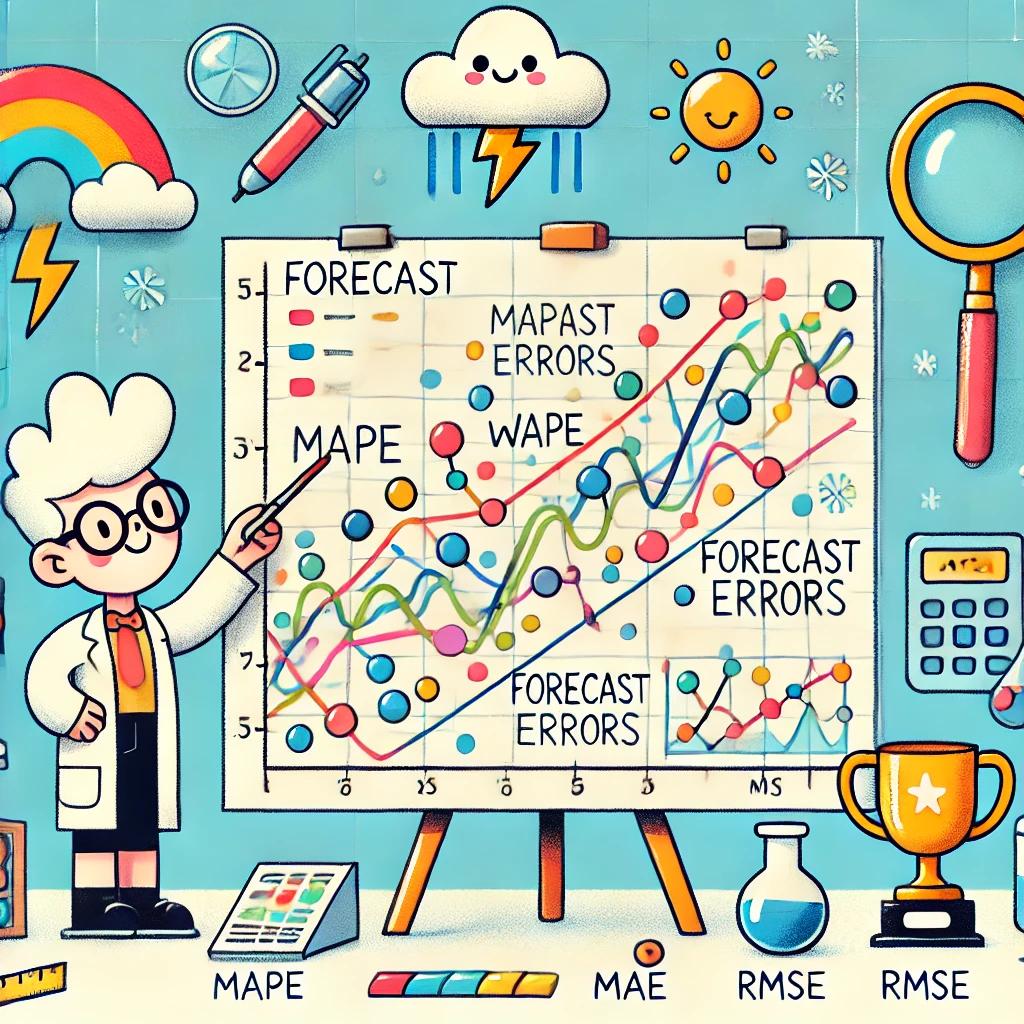
Understanding Performance Metrics: Making Sense of Forecast Errors
Learn what MAPE, WAPE, MAE, RMSE, and coverage metrics actually tell you, and which forecast metrics matter most for real staffing decisions.
Key takeaways
- Forecast metrics are useful only if they help teams make better staffing decisions, not just prettier reports.
- MAPE is easy to explain, but it can be misleading in low-volume or zero-volume intervals.
- WAPE, MAE, RMSE, and interval coverage each highlight different forecasting risks.
- Most workforce teams should track a combination of metrics instead of relying on a single accuracy score.
Forecast metrics are not just reporting tools. They decide whether a forecast feels trustworthy enough to use.
That matters because workforce teams do not evaluate forecasts for academic reasons. They evaluate them because a forecast drives staffing assumptions, scheduling decisions, and coverage risk. If the metric is misleading, the planning decision can be misleading too.
This is where teams often get stuck. One forecast might look good on MAPE and weak on RMSE. Another might have strong average accuracy but fail badly in the busiest intervals. A third might produce clean-looking point forecasts but poorly calibrated uncertainty ranges. None of those are small details if the forecast is being used to decide coverage.
A better question is not "Which metric is best?" It is which metric helps us understand whether this forecast is good enough for the decisions we need to make.
This guide explains the most common forecast error metrics, where each one is useful, where each one can mislead you, and which combinations tend to work best for workforce planning teams.
What makes a forecast metric useful
A useful metric does more than summarize model performance. It reflects the kind of mistakes that matter operationally.
- It should fit the shape of the data, including low-volume periods, spikes, and uneven demand.
- It should help planners judge whether the forecast is reliable enough to staff against.
- It should not hide the kind of misses that are expensive in practice, such as large errors in high-volume intervals.
- It should be interpretable enough that teams can actually use it in planning reviews.
MAPE (Mean Absolute Percentage Error)
MAPE tells you, on average, how far off the forecast was in percentage terms. That is why people like it. It is easy to explain and easy to compare at a glance.
If a planner says a forecast was off by 8%, most people immediately understand what that means.
Where MAPE helps
- quick percentage-based reporting
- simple comparisons when volumes are reasonably stable
- stakeholder conversations where a relative error is easier to understand than an absolute one
Where MAPE misleads
- low-volume or zero-volume intervals can make the metric unstable or unusable
- small absolute misses can look dramatic when the denominator is tiny
- it can make a forecast look worse than it feels operationally in sparse demand patterns
For workforce teams, this matters because many real operations do have quiet intervals. If your volume dips close to zero overnight or between peaks, MAPE can distort the picture.
WAPE (Weighted Absolute Percentage Error)
WAPE is often more practical in operational forecasting because it puts the error in relation to total actual volume instead of averaging each percentage equally.
That makes it more stable in environments where some intervals matter much more than others.
Where WAPE helps
- operations with uneven demand across the day or week
- cases where high-volume periods should influence the metric more than quiet ones
- forecast reviews where planners want a more operationally grounded percentage view
What WAPE still misses
- it can still hide when the largest misses happen in the most sensitive intervals
- it does not tell you whether a few large misses are driving the problem
- it is still one summary number, not a full picture of forecast risk
For many workforce teams, WAPE is a better overall accuracy metric than MAPE. But it still should not be the only thing you track.
MAE (Mean Absolute Error)
MAE tells you the average size of the miss in the original unit, such as contacts, tickets, or hours. That is useful because it is often closer to how planners actually think.
If your average miss is 18 contacts per interval, that can be easier to translate into staffing implications than a percentage alone.
Where MAE helps
- understanding average miss size in operational units
- comparing forecast models when you want a straightforward average error
- staffing conversations where absolute error is easier to connect to coverage impact
Where MAE is limited
- it does not show whether the miss is large or small relative to demand
- the same absolute miss can be trivial in one interval and serious in another
- it does not especially emphasize the biggest misses
RMSE (Root Mean Square Error)
RMSE is useful when large misses are especially painful. Because it squares the errors before averaging them, it gives more weight to bigger mistakes.
That makes it useful in planning environments where a few large misses can do more damage than many small ones.
Where RMSE helps
- surfacing forecasts that occasionally fail badly
- operations where large misses create outsized coverage problems
- model comparisons where tail risk matters, not just average miss size
What to watch with RMSE
- it is sensitive to outliers
- it can make a forecast look poor because of a handful of extreme misses
- it needs interpretation alongside other metrics, not in isolation
For workforce planning, RMSE becomes more valuable when the cost of a large miss is operationally severe, for example when understaffing a peak creates service failure or backlog that spills into later intervals.
Coverage metrics for uncertainty ranges
Point forecasts are not the full story. Good forecasting systems should also help teams understand uncertainty. Coverage metrics do that by testing whether forecast ranges are calibrated well enough.
If you say the actual result should fall inside a prediction interval 90% of the time, coverage tells you whether that is actually true.
Why coverage matters
- it shows whether a model is overconfident or too cautious
- it helps planners judge whether ranges are useful for decision-making
- it is important when staffing decisions depend on risk, not just the midpoint forecast
What coverage does not solve on its own
- very wide intervals can look well calibrated while still being too vague to use
- good coverage does not mean the point forecast is strong
- you still need to ask whether the range is actionable for staffing decisions
Which metrics should a workforce team actually use
Usually not one. Most teams benefit from using a small combination of metrics because each one highlights a different kind of forecasting problem.
- Use WAPE for a stable overall relative view of error.
- Use MAE or RMSE to understand absolute miss size and whether large misses are hurting you.
- Use coverage metrics when forecast ranges are part of the planning process.
The exact combination depends on how the forecast is used, but one metric alone is rarely enough if the forecast is meant to support real staffing decisions.
The bigger mistake teams make
The biggest mistake is treating forecast accuracy as a model problem instead of a staffing problem.
- Teams look at averages only and miss where the painful intervals are.
- They review overall error but ignore whether the forecast failed during the busiest windows.
- They compare models without asking whether the errors would have changed staffing decisions.
- They treat a cleaner dashboard as success, even if coverage outcomes did not improve.
This is also why forecast quality connects directly to broader workforce planning decisions. Once a team trusts the forecast, it can make better use of staffing logic such as Erlang models and simulation.
Good metrics help teams make better decisions
The best forecast metric depends on how the forecast is being used. A simple percentage metric may be enough for high-level reporting. A planning team making staffing calls usually needs something more grounded.
What matters most is not whether the metric looks sophisticated. It is whether it helps the team decide if the forecast is good enough to act on.
That is where Soon forecasting fits. Better forecasting workflows make it easier to evaluate forecast quality, understand where the real risk is, and turn that insight into stronger staffing decisions.
Product
Explore Soon forecasting
See how Soon helps teams evaluate forecast quality, understand coverage risk, and turn forecasts into better staffing decisions.
Explore